“The inclination of blue to deepen is so strong that its inner appeal is stronger when its shade is deeper. The deeper the blue the more it beckons man into the infinite, arousing a longing for purity and the supersensuous. It is the colour of the heavens just as we imagine it, when we hear the word heaven,” Kandinsky wrote in the book On the Spiritual in Art.
 Blue is the color of the eternal, the unending, just like it’s conveyed to us in their works by the great masters of art: Kandinsky, in Sky Blue; Yves Klein, with his unmistakable deep ultramarine tones in his monochromatic works; Henri Matisse, in the last stage of his life with the Blue Nudes series of cut-outs; and Magritte, who awakes in us a sensation of timelessness, of eternity, when we watch his blue skies with weightless clouds.
Blue, Blue
Violet blue, steel blue, cobalt blue, egyptian blue, Klein blue, navy blue, Pantone blue, Prussian blue, ultramarine, turquoise blue, lapis lazuli, cyan, sky blue, royal blue, indigo, lavender, blue-gray, zaffer, light blue, gentian blue, teal, pale blue… When we talk about a color, how do we know that we’re talking about the same one? That your interpretation of that particular shade of blue is the same as mine? How do we find a unified system to identify colors? The Pantone guide is born out of the necessity to create a common language to identify and use colors in a universal way. In 1962, Lawrence Herbert created a chromatic identification system: the Pantone Matching System, so printers could work in a uniform way, getting the exact same color each time they were used. Through time, the Pantone guide has expanded its chromatic range: in 1963, the first Pantone guide was composed of 500 colors; in 2010, 566 new colors were added to it, reaching a grand total of 5,024 colors. Each year Pantone chooses a new color, and this year ultraviolet has been chosen to “evoke a counterculture style, the originality, ingenuity, and the visionary thinking that leads us to the future,” according to Laurie Pressman, vice president of the Pantone Color Institute. By choosing an annual color and explaining its interpretation of it, Pantone speaks to us about the vibes and psychology of the color, translating the present into a chromatic tone.
Blue to Me
Yves Klein used to compose his paintings with the traces left behind by nude models who had their bodies covered in blue painting. He directed their movements, using them as paintbrushes. He would ask them to walk, to curl themselves up and stretch over fabric or a white canvas. In this week’s workshop we’ll let ourselves be inspired by Klein. First, we’ll visit the Museo Nacional Centro de Arte Reina Sofía to see his work. We’ll reflect on the color blue, its different shades and what it evokes in us. We’ll name the different tones of blue. Afterwards, we’ll take an “ultramarine bath” and we’ll leave blue traces over a white piece of fabric with our bodies, composing something of our own.
When my body paints the fabric, I’ll think about what blue means to me:
Blue is the sailor I await on the beach.
It is with me when the sea lies in peace.
Serene, I’m filled by its depth.
Blue feeling of stillness.
Blue magnetic force in heaven and Earth.
In the Snow Country blue is everywhere.
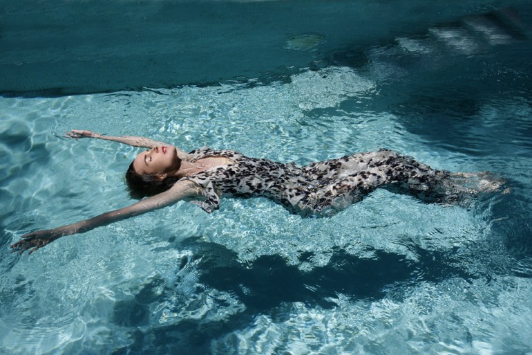
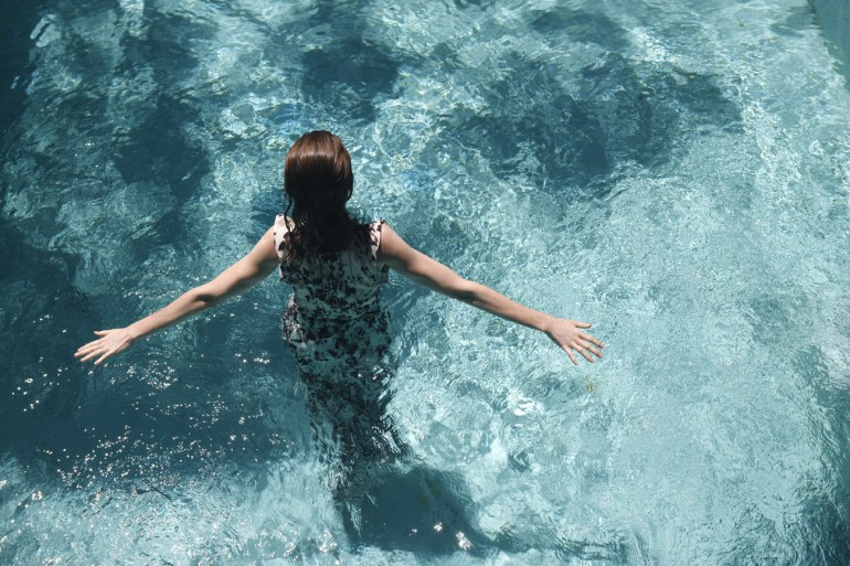
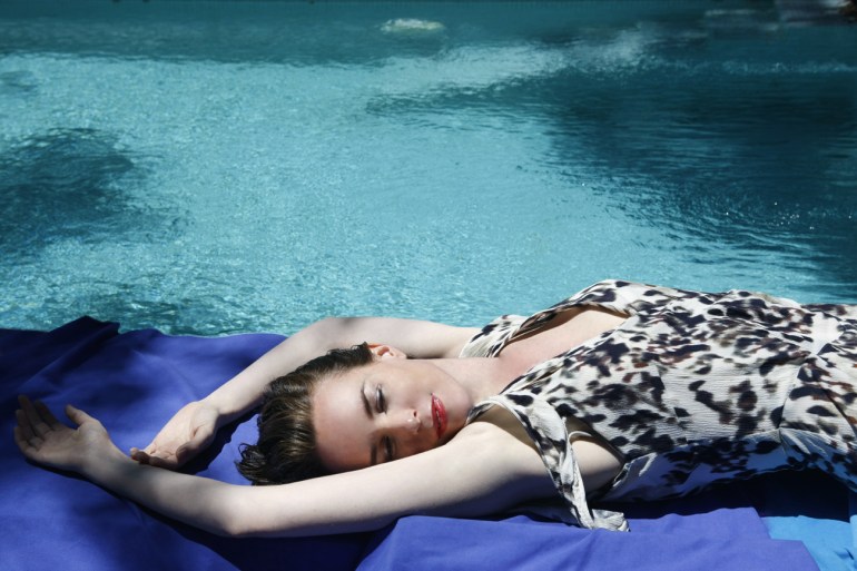
Photography: Oscar Rivilla
Conceptual Design: Carolina Verd
Fashion courtesy of Globally: dress by Intropia
